Thursday, 17 September 2015

Market Stall Overall Concept

Homework: Solidify your concepts for your overall market stall and products/packaging. Create a group presentation for next week (PPT or PDF) to show the class and your tutors for feedback. Presentations will be approx. 5- 10 mins. and need to give an overall concept of your brand, stall, individual products and packaging. For your blog entry you can upload a link to the presentation and a brief overview of your brand (1 paragraph).

My brand is going to be a minimalist collection of IPhone case designs. The aim of these IPhone cases is to capture a wide audience consisting of teenagers to adults and of both genders.
My designs will be a series of creative and abstract pieces created by me. These images are not mine, they are just an example as to what I will be aiming for in my designs.

 White is a very important aspect to minimalist designs, I will use this consistence throughout all of my designs so that they look like a product which has meaning and depth to it. Rather than my designs just being random patters on whatever surfaces.


As for packaging I want to immerse the customers in the IPhone cases. The method I will use to convey this appeal will be through the appearance and display of the product. When customers walk by my product they will see a finished clean and crisp IPhone design with packaging that respects the same elements.
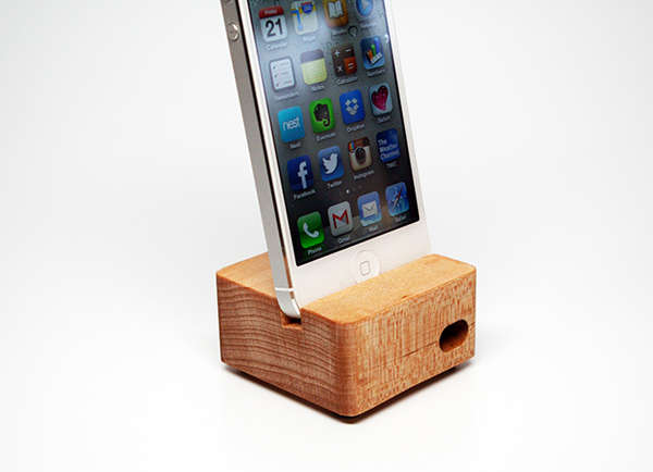
With packaging my design I want to package my IPhones in a cardboard box with a cut-out in the centre region (either a square or a circle). The cut-out will then be filled with a simple sheet of plastic from which the design on the IPhone case will be displayed. Something similar to this image.

To add to the depth of my product I will also be engineering some IPhone docks where phones can be displayed to play music. The overall design of the wooden phone docks will be simple and varnished a soil brown colour to slightly contrast the plain white of the phone cases.

Tuesday, 8 September 2015

The whole concept: branding, packaging and display

Homework: The whole concept: branding, packaging and display. Research a company from the list below that have won national and international awards for their overall retail concept. Discuss why these brands are successful by answering the questions below:
How does the company integrate packging, branding and display to give you an all round idea of their brand?
What does the brand "say" to the customer and why would someone pay more for this brand than another brand selling a similar product?
What materials have they used to achieve the overall "look" and feel of the interior and what does this "say" about the company?
Zumbo (http://adrianozumbo.com/, http://www.idea-awards.com.au/2014/adriano-zumbo-patisserie-3/)

Wednesday, 2 September 2015

Mood Board

Homework: Work with your groups to create a mood board and overall concept for your market stall. The mood board should give an overall concept of the feel and context of your brand. Your blog entry should define your target audience and give examples of other retail displays, materials and packaging that inspire you and create the "brand feel" that you would like your stall to have.

The moodboard below represents all of our individual products and stall ideas as a whole. Our target audience is mainly focused on older people who are looking to buy gifts for their loved ones. On the moodboard we chose a picture of a older lady carrying stacks of presents to represent out idea.

The general colour scheme for our products is pastel toned colours. The reason we chose to present our products like this is because it widens our colour pallet as a whole group whilst also not restricting us to any particular colour. 

For the packaging display we're leaning more towards cardboard boxes to give a gift-like feeling while also supplying options for the customers to get their item of choice gift wrapped.

As for our all together stall concept we started looking at different and quirky designs. We really liked the idea of incorporating different shapes. The moodboard below features a few different displays which all consist of different shapes of various sizes.


This is a simple display example to help us stimulate our idea.


After brainstorming we were able to sketch up some boxes for each member in our group. These boxes will be part of the stall; they will be used to display each of our products. We were given two each.


This is a sketch of all the boxes put together on the stall. When added up it manages to create a structure of a quirky stall.


This is a sketch idea which we had in the earlier stages of development.


Before we had the idea of curved boxes this was one of our stall concepts.


We decided that circles weren't enough structural support for a market stall which is where the curved rectangles and squares idea originated.


Thursday, 27 August 2015

Retail Display Research

How does the display of products in a supermarket vary?

Supermarkets display products in very similar ways regardless of how different their product is. The main goal when displaying a product is always the same. The product needs to stand out in a unique and appealing way for the consumers. Representation of the product needs to be clear and straight to the point. As well as the display being visually appealing and attractive to customers the foundation and design of the display is vital. The display needs to be durable and requires structural integrity while also being suitable for the product in terms of colours.
What does the display say about the products (ie. how are the vegetables displayed and how does this convey an idea about "freshness")?

The display of a product says everything about it, somewhat like a book cover for a book. The store needs to be evidently customized to the product so that the product sits adequately and profoundly in place. The products need to be organized in some sort of pattern which can range from colour, size or design. Seeing products organized like this gives the consumer a sense of value and meaning to the product.


What visual clues are given in a supermarket display to make you feel something about a product (ie. excitement because the product is "new" or to give you an idea about the "quality" or "freshness" of a product)?

Supermarket displays usually advertise something completely new that has not been seen before. Tricking customers into wanting to try this "new" product for the first time. A good example of this would be when Cadbury released their "Vegemite Chocolate". It was new, intriguing and easily assessed through stalls set up around the shop. However, the release of a new product requires some other aspect of advertisement for customers to purchase it. Woolworths did just this with their Vegemite Chocolate, when it was released they brought out a two for one deal which then persuaded customers to buy two blocks of chocolate because "they were already going to try the Vegemite Chocolate".

Sunday, 23 August 2015

Athlete's Foot VS Payless Shoes

What colours, typefaces, graphics does the company use on the packaging? What does this say about the value of the product?

Athlete's Foot package their shoes in a way that reflects on the store. All of their boxes are branded and have the company's signature colours, yellow, red and blue. Demonstrated through their packaging, their commitment to make Athlete's Foot stand out from other shoe companies is clear. Going to such lengths to make a product appeal more valuable to consumers visually. Both companies use simple serif fonts which are both appealing although at first glance the Athlete's Foot logo stands out more due to its colour scheme. The dominating red colour draws more attention to the contrary yellow and gray from the Payless Shows logo. However, Payless Shoes are boxed up in cardboard boxes with a plain gray or white surface.

What materials are used in the packaging (ie. card stock, foils, specialty papers, print treatments)? What do the materials tell you about the product value?

Athlete's Foot tend to put more effort into the packaging that regular shoe shops. Due to Athlete's Foot being a high quality product this needs to be displayed throughout all aspects of the shop from display, quality of products and packaging. Rather than going for a plain cardboard box packaging for their shoes Athlete's foot has gone for more of a premium feel. Their packaging in a simple design with their trademark colours red, yellow and blue while also adding a simple illustration. 

The shape and functionality of the box is too unique from standard shoe packaging. Their box is differentiated by its wider shape than usual as well as custom edges on the box to possibly hide any imperfections of the cardboard because if displayed incorrectly cardboard can look quite cheap and low quality.